The Biggest Transformation of the Explain Everything Brand To-Date

Table of Contents
Why the transformation?
Learning has been at the core of our business since our launch in 2011. For nearly 7 years, we have served educational institutions by continuously developing innovative ways for educators and learners to connect, collaborate, and share learning experiences. During that time, Explain Everything has evolved and grown beyond our expectations.
One of those factors of growth is increasing interest and adoption in the business world, proving that the need for technologies to help facilitate engaging learning and sharing experiences extends from classroom to boardroom. Therefore, it was necessary for us to evolve our brand to reflect the growth of Explain Everything into new markets.
This transformation, while holding true to our core values, realigns our visual language, messaging, and product offerings to show that Explain Everything is an effective learning and sharing platform for educational institutions and businesses alike.
The Brand Elements
Logotype

The logotype is a combination of two distinct elements to create contrast, interest, and a unique juxtaposition similar to what individuals create within Explain Everything.
Brandmark
![]()
Explain Everything’s mark was inspired by annotations made while using the app itself. It highlights the human aspect of the app and is used as the shorthand for the brand.
Color Palette

We chose a variety of colors for our brand palette to represent the welcoming and imaginative nature of the platform and also provide creative flexibility for visual communications. Our “hero” color is purple accompanied by 5 supporting hues.
Typography

New Hero is the font that forms the foundation of the brand across all points of communication. This typeface perfectly embodies Explain Everything’s balance of functionality and personality by appearing rational yet approachable.
Graphics & Symbols
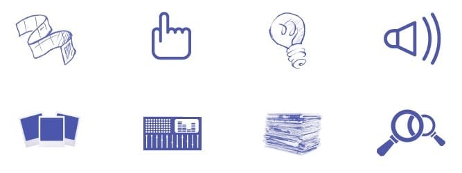
A set of mixed-style graphic icons was developed to express the mixed-media nature of Explain Everything projects. The mixing of styles also provides a great amount of creative possibilities for visual compositions and design.
The Canvas
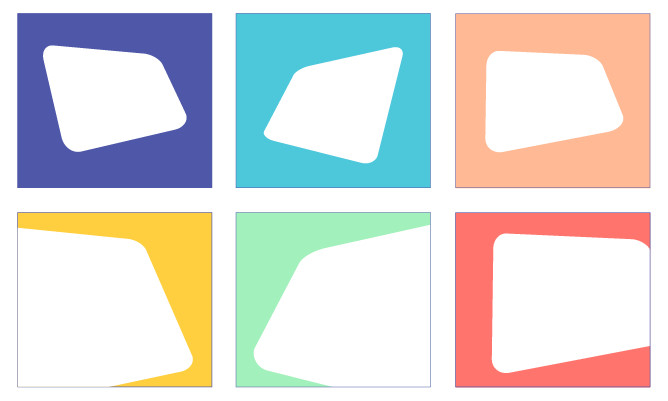
The canvas is an abstract representation of the “infinite canvas” on which you work and create within Explain Everything. It is primarily used to create visual dynamism in design executions and helps to accentuate the other elements in the layout.
The Brand Expression
When all of the elements come together, they form a harmonious “layering” of mixed content, further emulating what happens right in Explain Everything.
In addition to the visual evolution, we’ve refined our messaging to better highlight and emphasize the value Explain Everything offers to educators, learners, and professionals. And we’ve redesigned our in-app experience to help people learn, collaborate, and share in more productive ways.
We’re very excited to share this transformation with you and believe that it signifies our continuing commitment to providing the best option for you to collaborate and share.